When I started working with Comcast, their digital properties were rife with confusing IA, clumsy flows and clutter — a digital world shaped by it’s own tortured business siloes rather than the needs of it’s users. I worked on three massive reboots, designed to burn down the old sites and start from scratch.
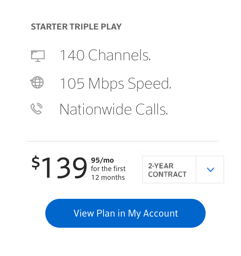
Comcast's tight KPIs and high-traffic make change a huge risk. Our massive redesigns were met with delayed approvals and implementation hurdles, and eventually just faded away. But a month after the particularly bitter cancellation of our new Xfinity site, one of our simplified offer cards appeared on xfinity.com. A single element had survived and was integrated by Comcast’s internal team. And it made the website just a teeny bit better.
So I changed my approach — outside of the massive Comcast projects, I partnered with Huge’s strategy department to work on a roadmap for incremental change.
The First Step was to map the user’s lifecycle with Xfinity. I charted the 3 year life of the average Comcast customer, accounting for media touchpoints, emotional framework and the biggest attrition points. This was the first holistic user journey in Comcast history, and it gave us the ability to plan small, testable changes to the interactions that are most important to the user.
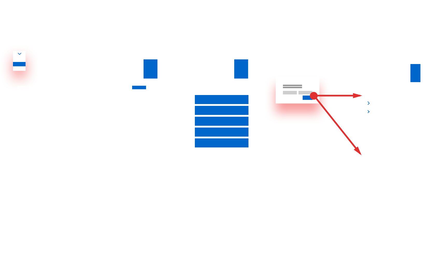
The next step was to create a set of individual modules and components that comprised the elemental site interactions: offer cards, plan comparisons, filter bars, device lists and perental permissions, all the way to the terms and conditions. A facelift designed like a Chuck Close painting, one square at a time.
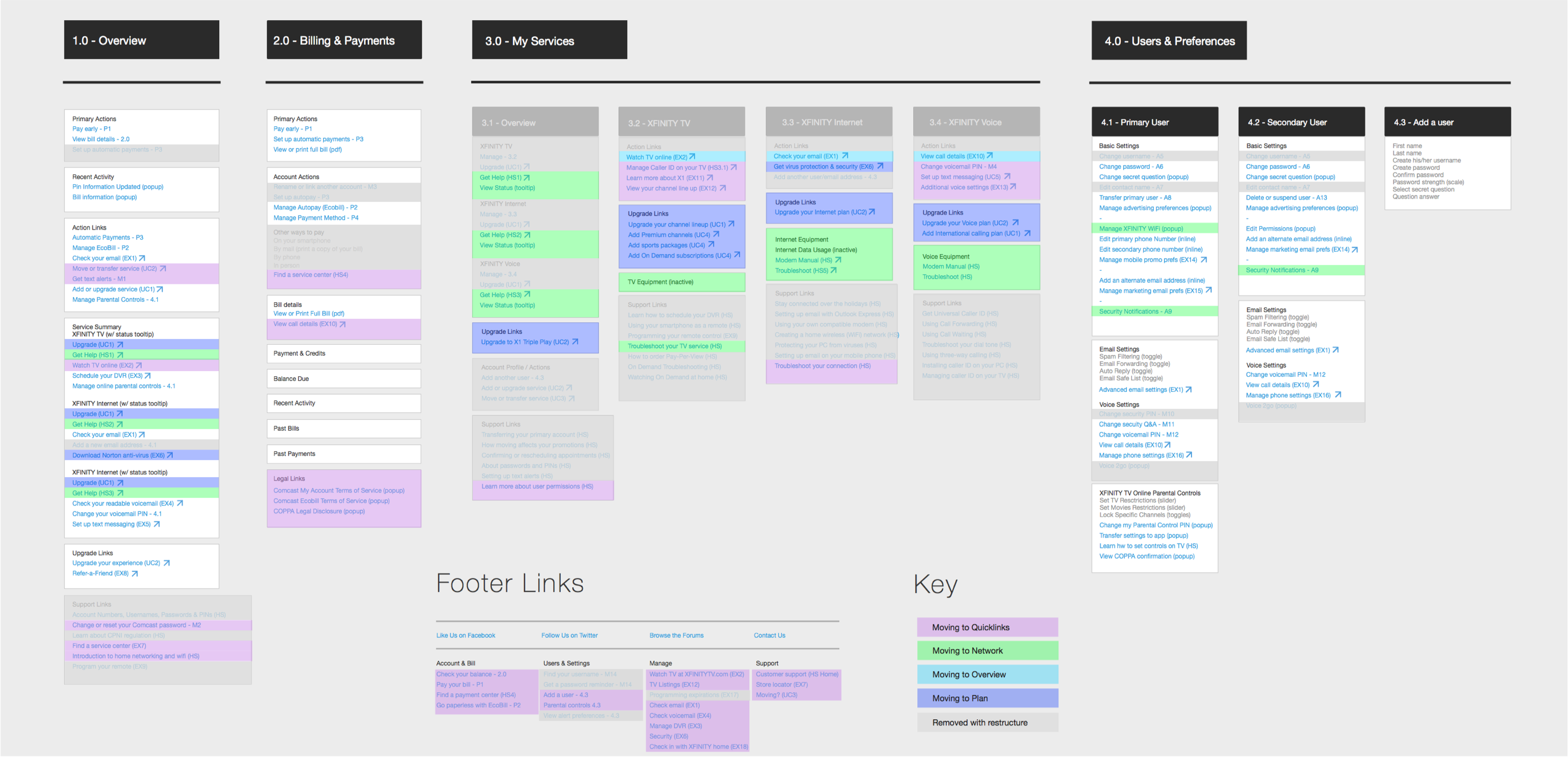
Finally, I drafted a new architecture for Comcast’s digital properties, mapping their chaotic site to a simplified structure organized by user need. This was the long-play, a roadmap for Comcast’s internal teams to guide years of development.
Much of my project work for Comcast will most likely never see the light of day, but by exposing their users’ needs, creating resources at the micro-level and drafting a roadmap for the future I’m already seeing change. Many of my atomic modules now float around their online properties, and with each update to their site and services, they’re cleaning up the sprawl and moving ever-closer to the elegant digital world I know they can become.
Finally, credit where credit is due. I worked for Comcast during my first year at Huge Inc in Brooklyn, with a fantastic team. Shout out to Randy Miller, who elevated Comcast’s limited visual brand to new heights of style. To Jenna Silverman, who so quickly and insighfully gets into the user’s head it’s actually a bit frightening. Stop reading minds Jenna, it’s invasive. And to Charles Fulford, a creative director who can always see the positive, and even in his harshest critique can make you feel good about your life and work. And to many more — thanks for your patience, and hold fast. We may not see the results of our work for a while, but 20 million people use Comcast and eventually, they might be a little less angry.