Reed Enger | Experience Design
Creating a more
Intranets have a bad reputation; they’re often a nest of broken links, confusing navigation and outdated content. But there's a reason why every year Nielsen Norman writes hundreds of pages on the evolution of the world's best internal networks. A good intranet can showcase the best aspects of a company, improve efficiency and help grow a strong culture.
Kohl’s needed a new intranet, and after working with Huge on close to a dozen successful projects, they asked us to build it. It was like being entrusted with their baby. Kohl’s is an unusually moral company, fueling stores with solar energy and encouraging employees to get healthy & take the stairs. Now they wanted one place for their 6000 corporate employees and 34,000 store managers to meet and work online.
I focused on three things to make Kohl’s intranet: simple information architecture, customizable workflow, and flexible administration.
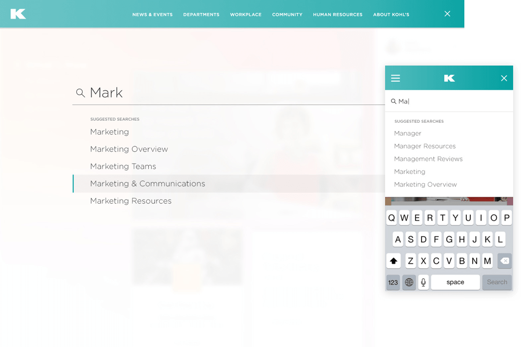
Step 1
Simple IA
The first step in making a powerful intranet is nailing down the IA. N&N refers to intranet content as being "varied and abundant" which is a pleasant way of saying it's usually a complete mess. Kohl's had thousands of pages for more than a dozen departments, often spiraling onto Google Drive and microsites. In our discovery interviews nearly everyone said the intranet had the information they needed, but had long ago given up looking for it.
A massive content audit was the only real way to understand what we were working with. I mapped the existing site, categorizing content by types and user need, then guided our UX and Content team in the development of a new site structure. It had to be similar enough to the existing site to be usable for long-time employees, and flexible enough to adapt based on the employee's role in the company, since the new intranet would serve both the 6000 corporate employees, and the 34,000 store managers nationwide.
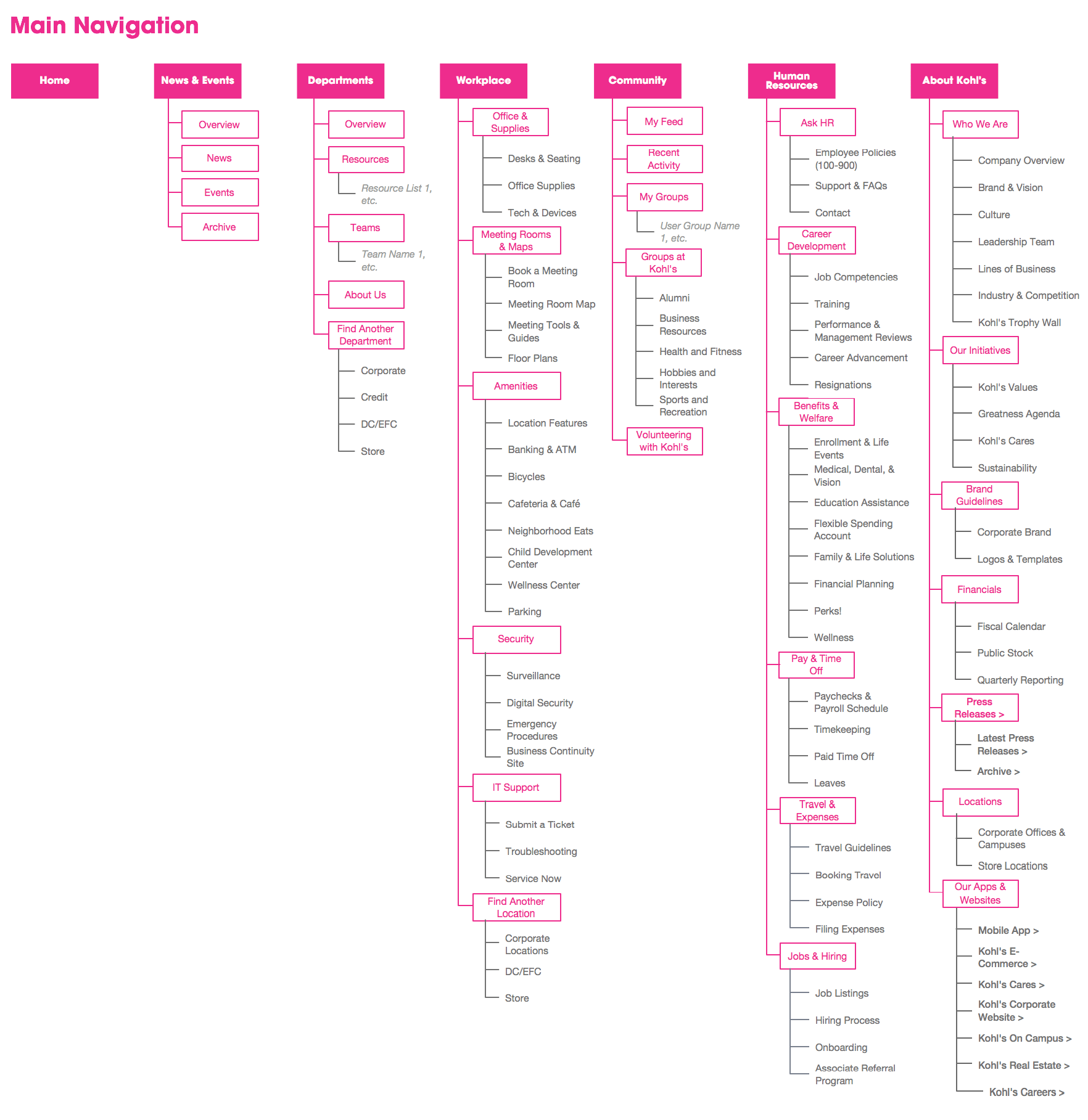
Step 3
Flexible System
Next I distilled the site's content into about a dozen types — article link, calendar, employee feature, etc — and created stackable, responsive components for each. With design and UX working in parallel sprints, this toolkit allowed our designers to begin crafting the visual language and hierarchy at a high-level, before final page content was ready.
With the components and grid complete, and the content audit nearly done, it was a simple task to defining templates for the primary page types — department, event, profiles and more. This is typically where I'd describe the surprise twist — where the scope changed or catastrophe was barely averted. But for Kohl's, the process was smooth. Our templates tested well with users, and the administrators quickly learned the new system of modular construction. Our fantastic designers, Natalie Mammone and Jordan Kasten-Krause polished the work to a mirror-sheen, and our developers deftly crafted even our most whimsical of details. It's a rare project that finishes this smoothly.